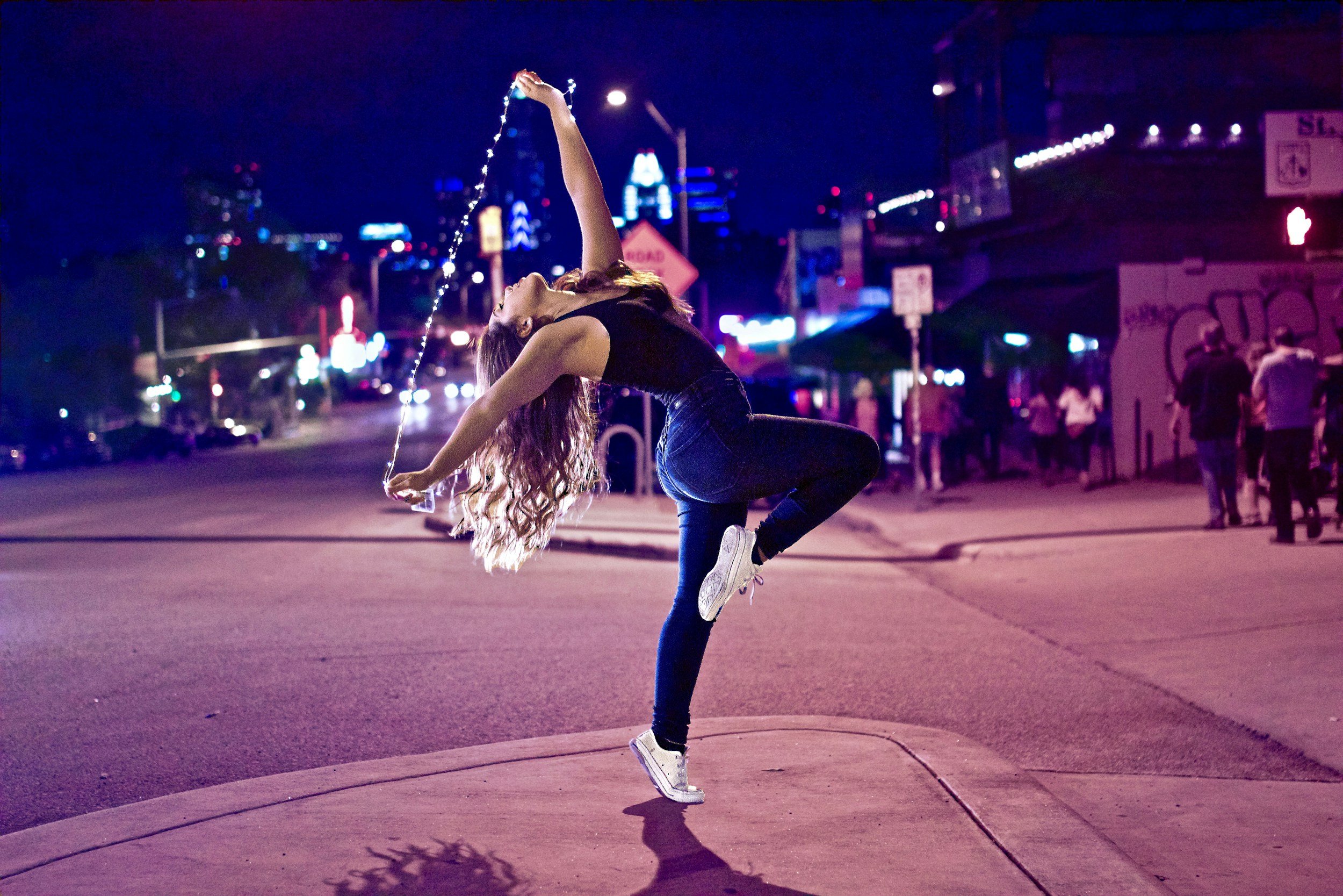
Find your rhythm
Designing a space where dancers can find events near them and even make plans with friends
Category
Social Media
Role
UX/UI Designer & Researcher
Client
Personal Project
Year
2020
Problem Overview
The ballroom dance community is fairly small, and when you think of people who practice ballroom dancing, you probably think of older couples that have a lot of free time and money.
However, there is a lesser known group within that community — collegiate ballroom dancers. These young folk love to go out with their friends to social events, such as salsa nights, where they can learn new moves as well as show off what they’ve already got.
The problem is that there isn’t a singular, organized resource for finding events. Currently, the most common ways of finding out about events is through word of mouth and Facebook. And the number of college students on Facebook is steadily decreasing (The Guardian).
So instead of relying on Facebook, emails from various studios and organizations, and word of mouth (through which details can get lost or mixed up), I created this app. “Rhythm” is designed to help dancers find events they’re interested in and easily share the details with friends.
User Research
The discovery process of this project revolved around a two-stage research plan. The first stage consisted of semi-structured interviews, conducted with five participants to gain qualitative understanding of their wants and needs. Stage two was sending out a survey to gather quantitative data from 20 more participants.
Key Findings:
Most dancers are actively looking for events.
Most dancers want to keep up with their friends.
Most dancers want control & flexibility in a new event-finding app.
Concepts & Sketching
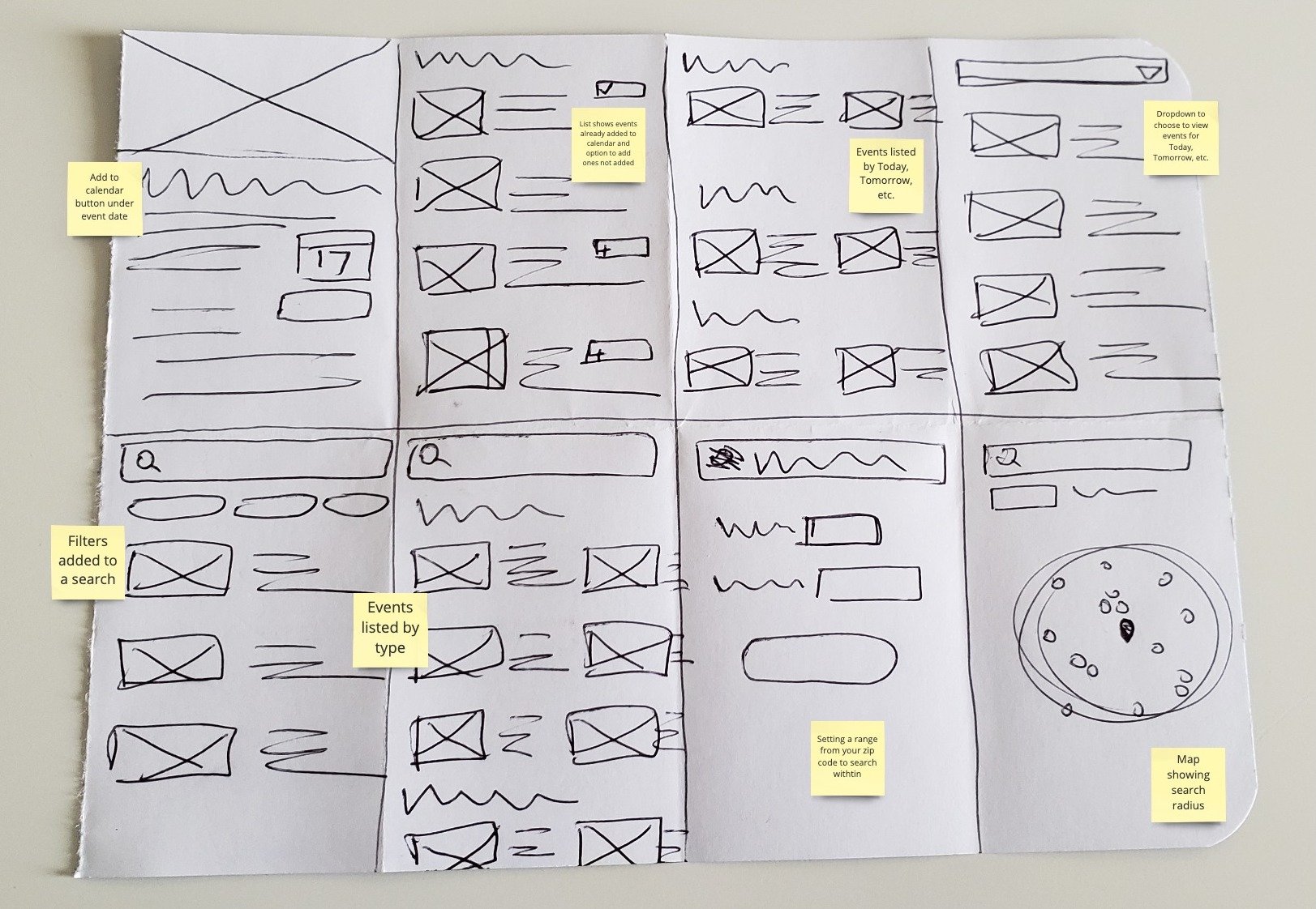
After organizing and analyzing all of feedback from the discovery phase, I started sketching wireframes. These were quick and simple, meant to just gave a generic idea of what content would be on each page.
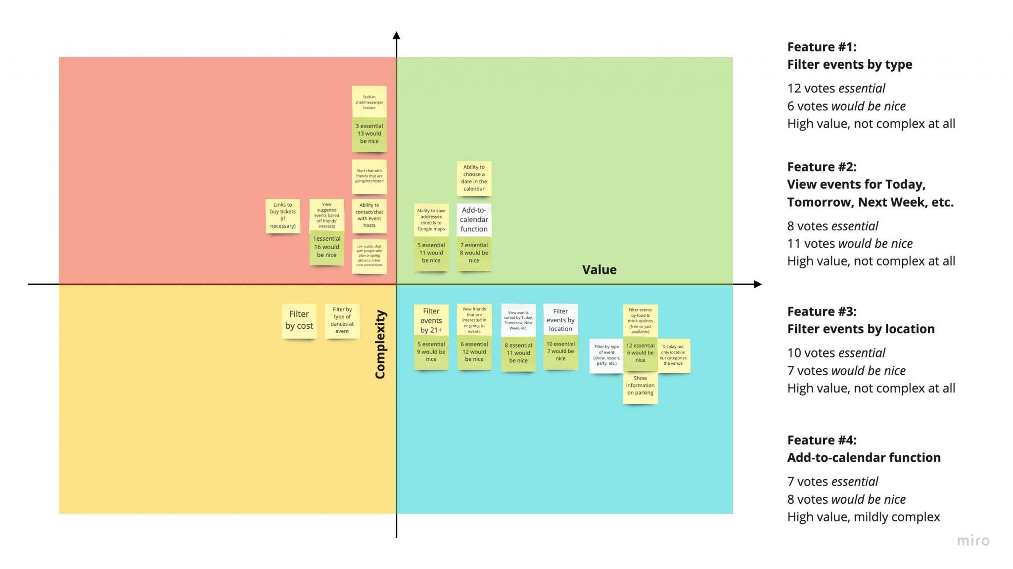
Feature Ideation & Prioritization
The sketches, interviews notes, and survey data were then used to determine which features were essential for the app. After the feature ideation process came feature prioritization. This is where I decided which ideas had the highest value and were the most reasonable to complete within the project’s timeframe.
Low-Fidelity Prototyping
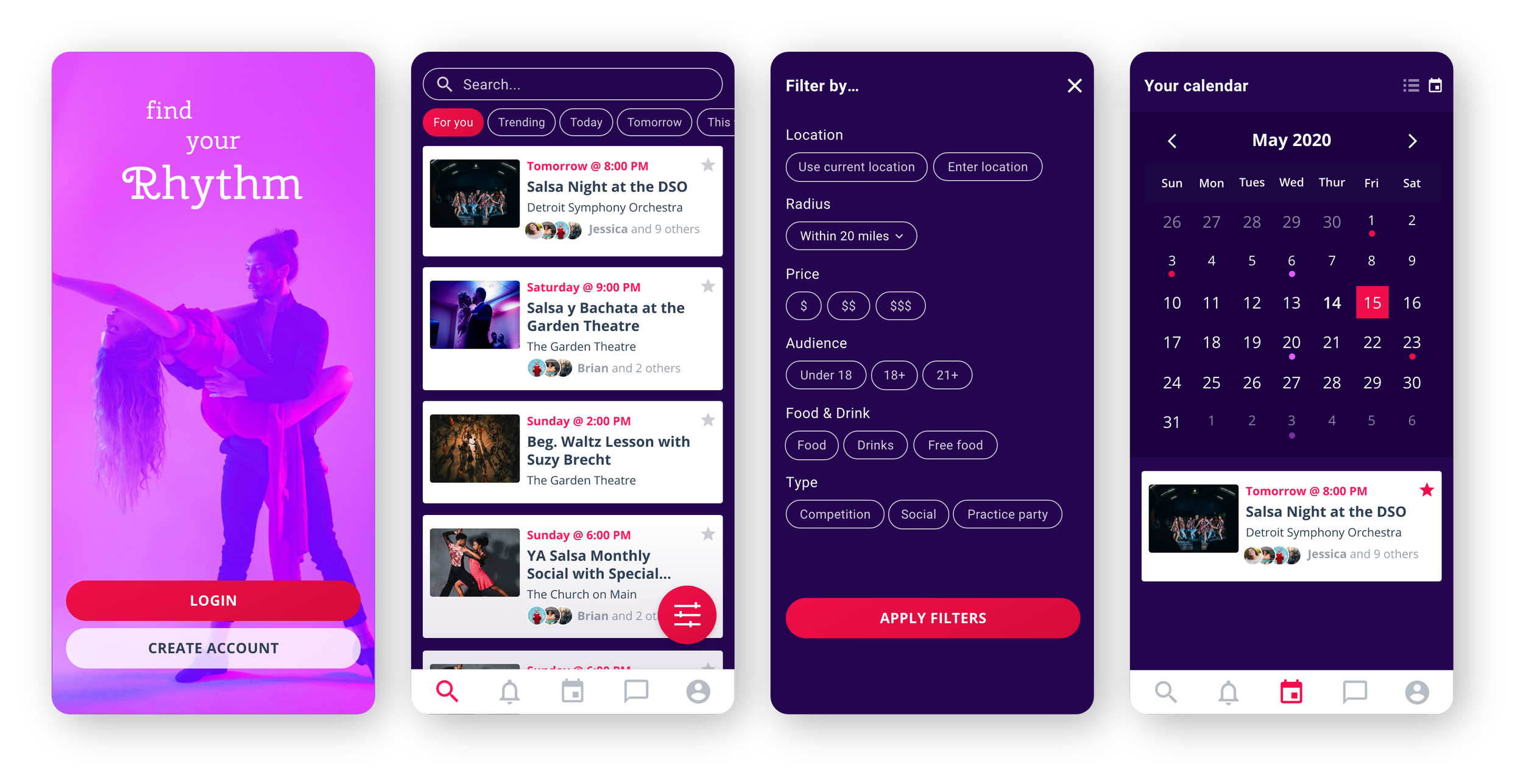
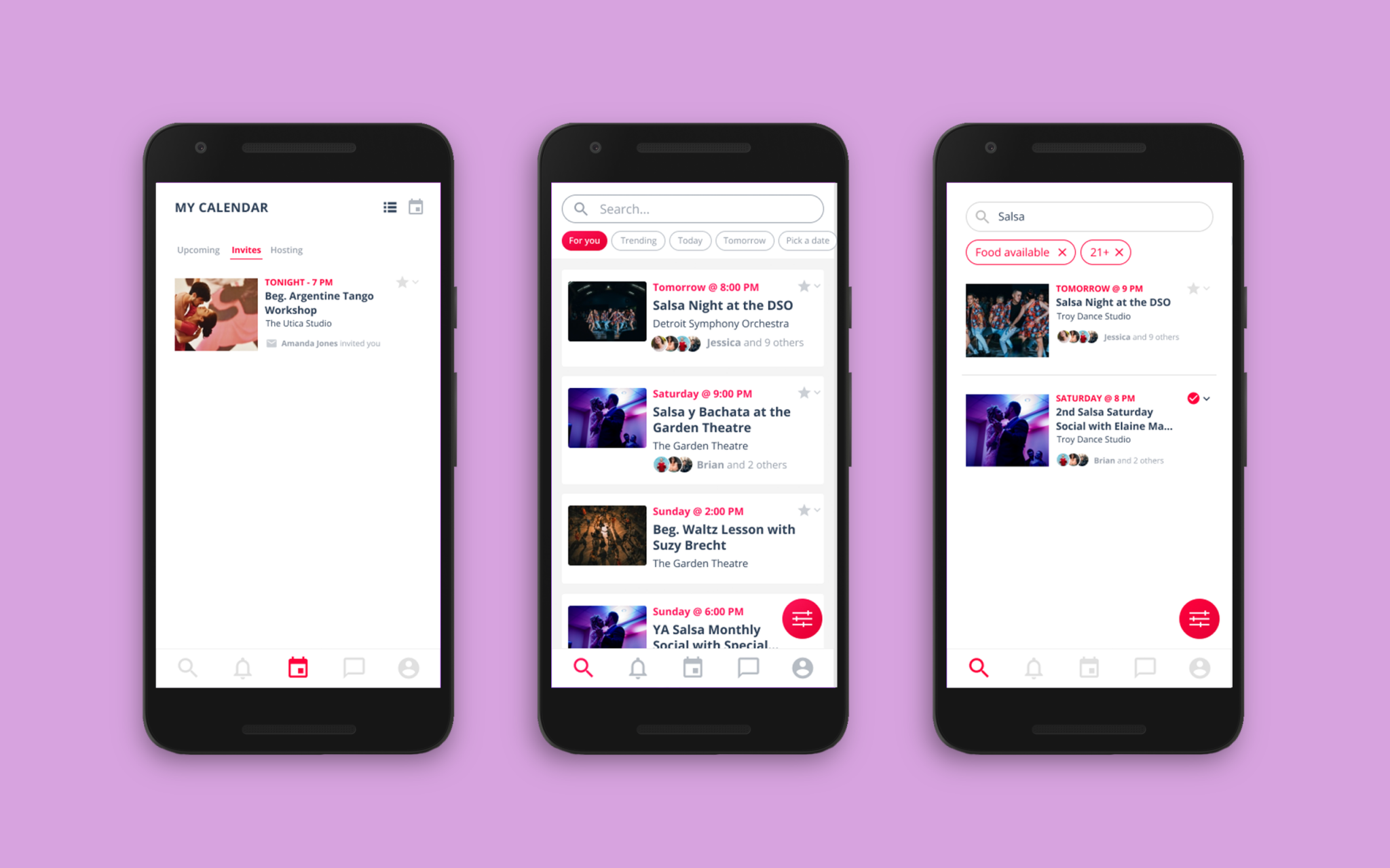
Through the feature ideation and prioritization phase, I decided to wireframe the login/create account pages, the main search page, what it looks like to filter a search, and what it looks like to add an event to a calendar.
This stage of the process felt more familiar to me, since I had experience designing and prototyping in Adobe XD and Sketch. In addition to user interviews and surveys, I had also never done usability testing on a low-fidelity design.

Usability Testing
Round 1: Low-Fidelity
During the first testing phase, I conducted usability studies on the low-fidelity prototype with the original five participants. Despite never having seen a prototype like this, 100% of the participants successfully completed all of the tasks.
Round 2: High-Fidelity
The high-fidelity design phase is where colors, fonts, button styles, and visual hierarchy are determined. After a few iterations, and some accessibility improvements, I proceeded to another round of usability testing to gain more feedback.
The second round of usability testing provided much more detailed feedback. Users were tasked with the following:
Either login or create an account.
Complete a filtered search.
Add an event to your Google calendar.
Again, all of the participants successfully completed all of the tasks. Overall, the consensus was that the app was visually-pleasing and easy to navigate. The main area of concern was the add-to-calendar function, which some users found confusing or unnecessary. This and other suggestions were taken into account while finalizing the design and user flow.
Dev Hand-Off
After making design adjustments from the second round of usability testing, I used Zeplin to prepare the app for development. On Zeplin I created a style guide for the project, which generated code for the type styles, HEX codes for the colors, and created a library of components that UI developers can easily access and grab lines of code from.

Conclusion
Key Takeaways
Users are happy to see something familiar that doesn’t take too much time to learn, something that is very straightforward in helping them accomplish tasks.
Users enjoy having various filters to cater searches to their needs.
With users successfully completing all of the tasks in both usability tests, the user flow seems to be very intuitive. Most participants agreed that the navigation icons are easy to interpret and the color palette and fonts are nice, simple, and not distracting to the content. Many said that they would use this app if it were a real product.
In a real-world setting, I would love to market Rhythm as not just a dance-specific event app, but to offer all kinds of events.
After completing the Udacity course, I made further design and interaction improvements in an Adobe XD file.
Check out my interactive prototype!